By Virginia DeBolt
Accessibility can be part of your normal workflow in Dreamweaver. Developing work habits that include the built-in accessibility help offered by Dreamweaver will not add any significant time to your projects. The information in this article applies to Dreamweaver MX 2004. This version of Dreamweaver has many new features aimed at making accessibility easier to create in the Dreamweaver environment. In older versions of Dreamweaver, any of the features described are possible, but may require some hand coding in Code View.
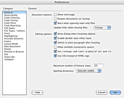
Long-time Dreamweaver users will benefit from a careful re-examination of their work habits to take full advantage of what Dreamweaver has to offer. The first step is to set the for maximum accessibility help.
In the category:
Tagging elements with semantically meaningful tags such as strong or em is important for accessibility. The idea of using semantically logical elements to create content is a foundation concept that applies to other element choices as well.
Accessibility requires that you separate content from presentation.
To do this, you must use HTML to structure the document with logical semantic elements that are clearly organized into headings, paragraphs, lists, and other logical content blocks. By using the generic HTML container div, you can add context to the structure to give yourself powerful descendant selectors for your CSS.
More information is available in The Early Bird Catches the CSS: Planning Structural HTML.
In the category, select every option.
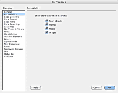
With these preferences selected, Dreamweaver will help you by reminding you to include labels on form objects, alt text with images, and other important accessibility attributes.
This is important as the number one accessibility need is effective alt text.
Dreamweaver has a number of built in reference materials, including the UsableNet Accessibility Reference.
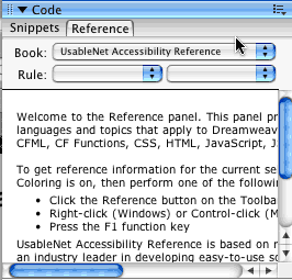
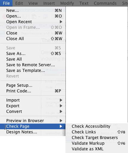
Dreamweaver will run accessibility checks for the page.
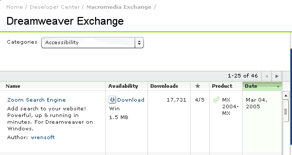
On the day the following screen shot was taken, Macromedia Exchange offered 46 extensions related to Accessibility in Dreamweaver. Not all are free, but they are worth exploring to see if they will help with your particular needs.
Smart Link is one of many helpful extensions available from Macromedia Exchange. In Dreamweaver, the dialog box gives you the following options.
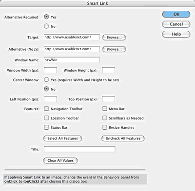
Smart Link converts an existing link so the target page opens in a new browser window. It works in a similar way to the Dreamweaver Open Browser Window behavior, or using target="_blank", but gives you far more control over its look and position. Although it uses JavaScript, it is smart enough to work even if JavaScript is disabled, by opening the page in the same window.
This keeps your site accessible to everyone, and is far more user-friendly than a link that doesn't work at all. It also has the advantage of keeping your pages valid, unlike target="_blank" which has been deprecated by the W3C.
To be accessible, pages should work if JavaScript is disabled. In most browsers, you can deselect the JavaScript option quickly, as in this Firefox preference option.
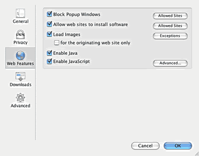
Test your pages with JavaScript disabled to be sure your navigation and other functions are usable. Some of the assistive browsing devices in use by people with disabilities do not understand JavaScript.
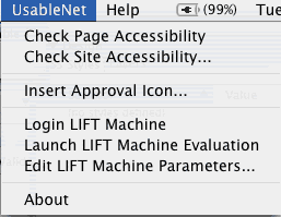
Two valuable tools are available from UseableNet.
A common barrier to accessibility is the failure to address the needs of visitors who are unable to navigate the site with a manual pointing device, such as a mouse. Accommodating users who rely on the Tab key can be a daunting task unless the content is structured logically.
According to Elderweb, the “ideal” web page would present text in a logical order to every user agent:
Browsers and assistive devices read English documents from left to right and from top to bottom. The order of the HTML from left to right and top to bottom is called document flow.
Since not every document meets the ideal described above, many use skip navigation links. A skip navigation link allows the user to tab directly to the content. There have been numerous attempts to provide skip navigation links that are not visible to the normal user, but which would be usable by screen readers. For example, a negative margin of 1000px to move a skip navigation link out of the viewport, while still allowing it to be read by a screen reader.
The current wisdom on best practices for skip navigation is to make it visible in the viewport and to use the words "skip to main content" as the link text.
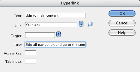
If your document contains a div for the main content that is identified with a named id, Dreamweaver can create a link directly to that id. Highlight the link text and select .
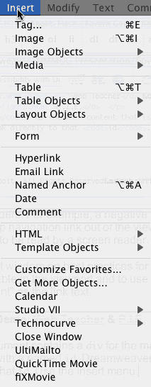
Before you select you
need the name of the id to link to and the
name of the HTML page, if it is different from the page you are on, to
complete the dialog box. You type this information in the dialog box.

You could also manually type the same information in using Code View or the quick tag editor:
<a href="#content">Skip to main content</a>
When tabbing through a menu, the currently selected element can be indicated with the a:focus pseudo class.
Dreamweaver does not include a:focus among its pseudo class options.

As with other advanced selector names, you can type the a:focus selector in the Selector field when defining a style for a:focus.
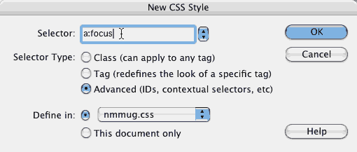
In your CSS, the order of the links should be Link-Visited-Hover-Focus-Active to ensure that the pseudo class will work in most normal situations.
Use Code View or the Quick Tag Editor to add the class to the code. Here's a code example:
a:focus:hover { background: white }
Pseudo class selectors can be combined, as you can see in the code above. Focus works for those using the Tab key, hover for those using the mouse.
This is not widely used yet, and it provides no value for a person tabbing through a site using a screen reader. It does provide a visual cue to people tabbing through a site who can see what they are doing.
Look again at the dialog box. (On the Insert bar, insert hyperlink is under the Common tab.)
There are accessibility advantages to using the dialog box. It contains fields for target (deprecated in XHTML), a title, and values for access keys or tab index.

Using meaningful link text (as opposed to 'click here') is a key accessibility feature. However, a title can provide helpful detail to explain what to expect when clicking a link. Although Dreamweaver has a number of other ways to create a hyperlink, none of them provide the title field.
Different browsers display the title attribute in different ways. Many show it as a tool tip when the element is hovered over.
The Insert Hyperlink dialog box (for the anchor or a element) provides a way to insert the title attribute. Dialog boxes for other
elements do not provide a way to add the title attribute. For other elements, a title attribute could be added in Code View or with the
Quick Tag editor.
The acronym or the abbr element should be used to expand acronyms and abbreviations on first use. The bar has an icon for abbr and acronym in the text category. Macromedia's geeky joke of a label for the icon for the acronym element says
Rumor abounds that the W3C plans to deprecate acronym and use abbr for both acronyms and abbreviations in the future.
Either tag requires the addition of a title attribute to explain the meaning. For example,
the <acronym title="World Wide Web Consortium">W3C</acronym> plans to
For inserting images, Dreamweaver asks you to add both alt text and a longdesc.

Most images don't require a longdesc, but an image conveying content such as a graph should be given a longdesc.
To add a longdesc attribute some elements, you must use either or the .

Just having a longdesc attribute pointing to an HTML page containing a long description of the material isn't quite enough, because some older assistive devices don't announce the longdesc link to users. A commonly understood workaround is to put a visible link to the long description page in the form of a lowercase d, like this. [d] This method of visibly indicating the presence of a longdesc attribute with a "d-link" has been deprecated by the W3C. Most modern screen readers read the longdesc to users while the attribute remains unseen in visual browsers.
Many elements in addition to links can have title attributes. See the
W3C for more info. Read this excellent article about the alt, title, and longdesc attributes from 456 Berea Street.
When setting font-size or element width and height, Dreamweaver offers several measurement units.

For web display, setting the measurement units in ems or percentages is the most accessible choice. This allows the user to resize to suit individual needs.
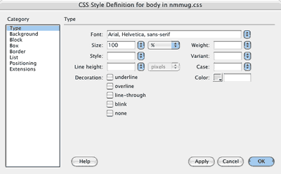
Setting the font-size, for example, to 100% (or 1em) in the body style, means that the user's default font-size will be used for any text in the entire body. Of course, you may add styles for individual elements that are based on that 100% point of origin. For example, you might make the font-size of a level one heading 150% (or 1.5em) or the font-size of a footer paragraph 90% (or 0.9em).
When using percentages with floated elements, make the various divs add up to 98% or 99%, rather than 100% to allow for rounding errors and to accommodate the extra 3px that Internet Explorer adds to floated elements.
Make the most of Dreamweaver's insert table dialog box options.
Notice that the size presentation options are going to be in the CSS, not inserted here as HTML presentation attributes. This is one way to separate content from presentation with semantically clean HTML.
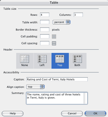
If you select the option for the top of each column, Dreamweaver automatically includes scope="col" in the th elements, an accessibility feature that identifies the content of each cell as being related to the th for users of assistive devices.
| Name | Rating | Cost |
|---|---|---|
| Michelangelo Palace | 4 stars | €150 |
| ClassHotel Terni | 3 stars | €83 |
| Del Lago | 3 stars | €70 |
Using the box for a table with headers at the top and the sides is also helpful. Look at this table, and the code Dreamweaver created for it.
| Event | Dates | Cost |
|---|---|---|
| Water Festival | June–July | Free |
| Cavour Art | September | Free |
| Circuito dell'acciaio | October | Free |
<table summary="Yearly events are listed with dates and admission costs.">
<caption align="top">
Yearly Events in Terni
</caption>
<tr>
<th scope="col">Event</th>
<th scope="col">Dates</th>
<th scope="col">Cost</th>
</tr>
<tr>
<th scope="row">Water Festival </th>
<td>June–July</td>
<td>Free</td>
</tr>
<tr>
<th scope="row">Cavour Art</th>
<td>September</td>
<td>Free</td>
</tr>
<tr>
<th scope="row"> Circuito dell'acciaio </th>
<td>October</td>
<td>Free</td>
</tr>
</table>
This help from Dreamweaver would be adequate for a simple table such as this. With headers on the top and side, Dreamweaver inserts scope="col" and scope="row" attributes.
With a complex table, however, there is nothing Dreamweaver does to help an assistive device match a cell to both a column heading and a row heading at the same time. Look at this graphic of a complex table, for example.
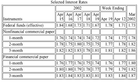
You must go into Code View and add header id attributes for the columns and rows, and then match each cell to the appropriate headers.
A good reason to keep your tables simple!
To demonstrate how id and header attributes work together,
let's modify the Yearly Events in Terni code from above, even though it isn't needed in a table this simple. The table code now becomes the following:
<table summary="Yearly events are listed with dates and admission costs.">
<caption align="top">
Yearly Events in Terni
</caption>
<tr>
<th id="event">Event</th>
<th id="dates">Dates</th>
<th id="cost">Cost</th>
</tr>
<tr>
<th id="water" header="event">Water Festival </th>
<td headers="water dates">June–July</td>
<td headers="water cost">Free</td>
</tr>
<tr>
<th id="art" header="event">Cavour Art</th>
<td headers="art dates">September</td>
<td headers="art cost">Free</td>
</tr>
<tr>
<th id="acciaio" header="event"> Circuito dell'acciaio </th>
<td headers="acciaio dates">October</td>
<td headers="acciaio cost">Free</td>
</tr>
</table>
See the W3C for complete details and more information.
In accessibility terms, tables are for tabular data only, not for layout.
Dreamweaver's dialog box offers a number of professionally designed style sheets and accessible layouts that you can modify.
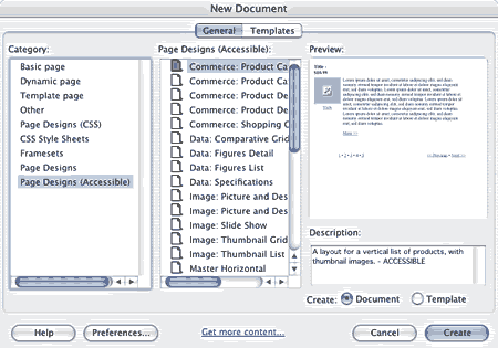
There are many freely available CSS layouts that will work in Dreamweaver.
The Web Content Accessibility Guidelines 1.0 has two priorities for color:
Dreamweaver does not have any built-in mechanism to check color contrast. Here are some helpful sources on the web.
Mozilla's Web Developer Tools will allow you to quickly check a page with the colors or the CSS disabled to see if it works in black and white. Be aware that just because it works in black and white, it doesn't necessarily mean that you have enough contrast for certain color combinations.
The recommendation is to use more than just a color cue. For example, instead of saying "Required fields are in red" you could say "Required fields are marked with a red star." You have two cues: the star and the red color.
Dreamweaver uses this icon (with abc on it) for the label attribute. Just to the right of it is the fieldset icon.
![]()
Making a form accessible involves:
fieldset elements with legends to group related form elementsIf you have set to use "Accessibility for Form Objects", Dreamweaver will automatically present the label options when inserting a form element.
If you use CSS for layout, all you need to do is wrap the label.
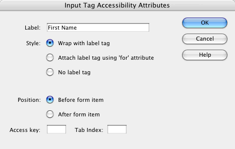
Use the to name the element “fname.” The resulting code should be:
 <label>First Name

<input name="fname" type="text" id="fname" />

</label>
The label associates the form element with the appropriate text. Any assistive device (e.g., Jaws, Home Page Reader) will understand this association.
If the form is laid out in a table, with the label and the form element in two different table cells, then you need the form attribute with an id on the form element. For an assistive device to make the connection between text in one table cell and a form element in another table cell, you must help out by telling which element (identified with an id) the text is for.
Dreamweaver only does part of this for you.
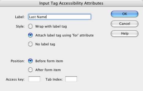
If you select “Attach label tag using 'for' attribute” you get the for attribute inserted along with an id attribute, but the naming is so generic it isn't helpful. Since a named id must be unique on the page, you have to do some tweaking to the names to make it useful.
You get this code:
 <label for="textfield">Last Name</label>

<input type="text" name="textfield" id="textfield" />
You can change the id to something more appropriate in the Property Inspector. Here the element is given the id “lname.”

However, the value of the id and the value of the for must match. To change the value of the for attribute, you must go into Code View and type the value you want for the for attribute.
The resulting code is:
<label for="lname">Last Name</label>

<input type="text" name="lname" id="lname" />
The value of for and id must match. The value of name does not have to match.
The dialog box for accessible form elements includes an option to change the tab index value. Try tabbing through your form to be sure the tab order is logical and adjust the tab index values if needed.
Related form elements can be grouped using a fieldset. Select the set of form elements you want to include in the fieldset. Click the fieldset icon and a dialog asking for the legend opens.
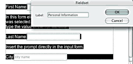
Note that the dialog box says “Label,” but in fact, the element you type here is the legend. However
since, label, fieldset and legend can all be
styled with CSS; this dialog field could be better named.
If a prompt such as “Type search words here” or “City Name” is needed, it can be entered directly in the input element using the Init val field on the Property Inspector.

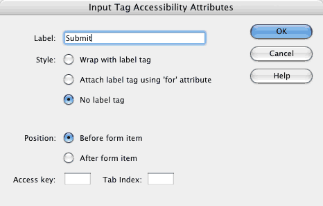
Make sure the form is submitted with a form control button, not merely by JavaScript. Because the form label is on the button, no label is needed.
Knowbility, Inc offers this check list of key features to include in an accessible website. Some are not part of the work you do in Dreamweaver (captioning, for example), but most are part of the Dreamweaver work flow.
longdesc attribute.title or name attribute.header attribute when presenting tabular data. Summarize table content.And finally, check your work. Validate the HTML. Use evaluation tools and text-only browsers to verify accessibility.
For complete details, see the W3C's Web Accessibility Initiative (WAI). Also valuable is the W3C's article How People with Disabilities Use the Web.
Copyright 2005, Virginia DeBolt, All Rights Reserved

Virginia DeBolt is owner of the Web Teacher blog and author of the book Integrated HTML and CSS: A Smarter, Faster Way to Learn.