by Miraz Jordan
Miraz Jordan introduces the concepts of block-level and inline elements and mentions padding, borders and margins along the way. You'll learn simple techniques using CSS to create accessible layouts, lists, links and navigation bars.
The year 2005 could mark a turning point in which cascading style sheets are almost always used to display web pages. Designers can use CSS to control fonts, colours, and a variety of other aspects of how a page should look. Of course, these are only suggestions; if we specify a red border and the visitor's screen can display only black and white, then our suggestion will be irrelevant in this case.
Some of the most common questions about style sheets involve handling links: some designers want their navigation links all in a list (but without the bullets); others want the links in a row across the page. Many want the links to be graphics-free "boxes" or "buttons."
We all know that we build an HTML page out of elements such as h1, h2, h3, p, a, div, span, ul, li. When it comes time to display those elements, it's helpful to understand that they fall into two groups:
Information about padding, borders, and margins will help explain this.

This photo of my cat under a rug shows that an element is at the core. Immediately outside the element is any padding. A border may go outside that. The margin is the area between an element plus any padding and border, and the items around it.
In the screenshot, my page has a black background. The element is img. I've used a style sheet to put the picture on an olive background which shows behind the generous 10px of padding around the picture. Then I have a 5px border in yellow. The picture is centred so the margins are equal on all 4 sides, between the border and (in this case) the edges of the browser viewing area.

A block level element stands on a line by itself and adds extra white space above and below, by means of a margin. A heading is a good example. A heading starts a new line and then claims the space between where it ends and the side edge of the browser window. A paragraph is another block-level element.
So, for example, a short heading won't have anything to its right (in languages written left-to-right).
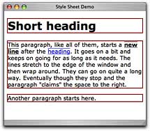
If you add a border to a block-level element you can see the "block" the element creates. The screenshot shows this in action. There are borders around the h1 and the p. Remember that a border goes between any padding and the margin.

An inline element is simply part of a line. An example would be em or strong or an anchor (a). You don't want some emphasised word or a link on a line all by itself, so it goes inline.
The screenshot shows a maroon border around the h1 and the p and an overline and underline around the strong and the link.

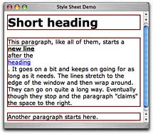
The next screenshot shows what would happen if a and strong were block-level elements. The anchor and the strong text would each start on a new line and force following text to flow to another line.
That would be downright stupid, but it makes the point that we need both inline and block-level elements. Notice, too, how it forced the full stop onto a new line.
Every element defaults to being either inline or block (or one of several other types of lesser importance). You don't need to specify which type it is, but you can override the default. Here's a partial list of elements:
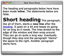
You can force a block element inline (as in the screenshot) …

… or make an inline element block.
The a element is usually inline — it's just part of a line, so you'd normally have:
Not very impressive or user-friendly!
To make it more usable, declare a to be a block element: a, a:link { display: block; }. Now it looks like this:
A list of links like that is, well, a list, so really it should be marked up as a list. By default, list items are block-level and they include a bullet point.
To make them go across the page set the list to be inline: li { display: inline; }.
This looks just like the first example above, but now it's officially a list, even though it looks like a disaster [but wait! There's more!].
That will set all your lists to be inline, and you need a bit more complexity with putting it into a div, but that's beyond the scope of this article.
By setting some borders, background-colors, padding, hover states and so on, you can have a set of beautiful navigation buttons without touching Photoshop.
All elements default to being either block-level or inline. You can override that default by declaring the display property. With a little imagination you can create inline lists of links which resemble buttons, but without creating graphics.
Listamatic is a fantastic resource for beautiful lists, including navigation lists.
Copyright 2005, Miraz Jordan, All Rights Reserved

Miraz Jordan is a writer, web designer and trainer of repute in New Zealand. She contributes the Newbies Guide and other articles to New Zealand's Macguide magazine and produces her own Mac Tips newsletter and other materials. Currently she's working on a book. Her popular Mac Tips and online tutorials are available at http://mactips.info.