Fireworks MX - Slicing Tutorial
by Judy Fontanella
I. Create your composite image or open one that has already been created.
For this tutorial, we will be working with an image that has already been created.
Download and then open start.png in Fireworks. You can download the .png
file or the .zip file depending upon which one works
better for you. Note that we are starting with an image that is 600 pixels wide
- the width of the narrowest screen size for my target audience. By starting
with the narrowest size, I know that the table that I am about to create will
fit comfortably on a 640 pixel width screen so that my visitors won't have any
horizontal scrolling.
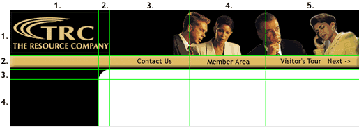
Also note that the image has guides that have been set to help you see
where the slices will be. If you can't see the guides, go to "View
->Guides ->Show Guides" and be sure that "Show Guides"
has a check mark in front of it. Then you should see the green guides.
Also go to "View ->Guides ->Snap to Guides." Be sure that
"Snap to Guides" has a check mark in front of it. This will
help you to draw your slices more accurately.
One more important thing to do before you start is to make sure your
Properties Panel is visible. Go to "Window" and be sure that
"Properties" has a check in front of it. Locate this Properties
panel. If necessary, click the expansion triangle in the upper left corner
of the panel so that it opens fully. When you draw your slices, you can
check the sizes and origins of each of the slices in this Properties panel.
They are visible in the lower left portion of the panel by the W, H, X
and Y. If the sizes aren't the same as those given in the chart below,
you can type in the correct dimensions and origins. Your slice will change
to the size and location that you typed in after you hit the Enter/Return
key.
The image is divided into 4 rows with 5 columns each or 20 sections.
However, we won't be making 20 separate slices. We'll combine a few of
the sections. The table that we will create to hold the slices will contain
some merged cells.
II. Create the slices for your image.
 Using
the Slice Tool, carefully create the 12 slices shown in the diagram below.
It is very important that your slices begin and end exactly on the guides,
or you will end up with a very complex table that will be very hard to
modify later on. If you have turned on "Snap to Guides" under
"View" ->"Guides," it will help you work more accurately.
Watch the origins and sizes of the slices in the Properties panel as you
work. Your slices should have the same dimensions as those in the diagram.
| 1. 170
x 77 (spans 2 columns) |
2. 430
x 77 (spans 3 columns) |
| 3.
170 x 25 (spans 2 columns) |
4. 138
x 25 |
5.
131 x 25 |
6. 161
x 25 |
| 7.
151 x 17 |
8.
19 x 17 |
9.
430 x 17 (spans 3 columns) |
| 10.
151 x 81 |
11.
19 x 81 |
12.
430 x 81 (spans 3 columns) |
III. Set the Optimization and Other Properties
for each slice.
- Use the pointer tool to select the first slice in row one. It contains
the company logo. We will use the Optimize and Properties panels to
set the options for this slice. Click the 2-up tab so that you can preview
the results of your optimizing choices.
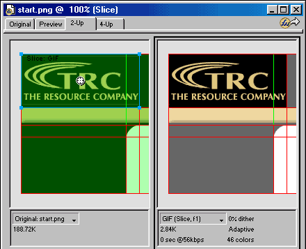
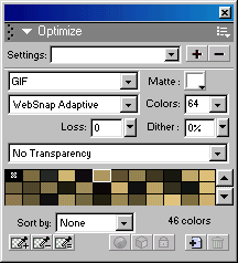
- Optimize Panel - This slice will optimize best as a .gif.
Choose .gif, Websnap Adaptive and 64 colors as shown.
- Properties Panel - This panel sets the type of slice we
want (HTML or Image), the URL of the page that it will link to (if
this slice will be a link), the alternate text for the image, and
the target of the link. We want to save this slice as an image, but
it won't link to another page. For "Type:" select "Image".
Leave "Link:" and "Target" blank. For "Alt:",
type "The Resource Company".
Now look at the left side of the Properties panel. Under "Slice"
it says, "start_r1_c1". This is the name that Fireworks
will automatically give to the image file that will be created from
this slice. The image files are identified by the name of the main
file, and the row and the column that they occupy. I like to give
the images more descriptive names, however. It helps me identify them
later on if I want to make changes. Replace the autoname with "logo".

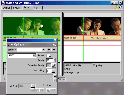
- Select the second slice in the first row with the people in it. Use
the options shown below in the Optimize panel. Note that this image
compresses better as a .jpg. In the Properties panel, name the image
"people", select "Image" as the Type:, and type
"Business People" after "Alt."
- Use the diagram below to set the Optimize and Properties options
for each of the other 10 slices in our image. Note that some of the
slices don't need to be saved as images because they consist of a solid
color. Why waste download time on an image to fill those table cells
when a background color or small repeating tile will do as well? Some
of these cells will have html text entered into them later, as well,
so we can't place and image into them. For these slices, we will choose
"HTML" as the Type:, instead of "Image."
1.
Type:Image,
Link: None,
Alt: The Resource Company
Name: Logo
gif/64 |
2.
Type: Image
Link: None
Alt: Business People
Name: people
jpg/75 quality |
3.
Type: Image
Link: None
Alt: ""
Name: topleftbar
.gif/32
|
4. Type:
Image
Link: contact.html
Alt: Contact Us
Name: contact
.gif/32 |
5. Type:
Image
Link: members.html
Alt: Members' Area
Name: contact
.gif/32 |
6. Type:
Image
Link: tour1.html
Alt: Visitor's Tour
Name: tour
.gif/32
|
| 7.
Type: HTML |
8.
Type: Image
Name: corner
.gif/16
Alt: "" |
9.
Type: HTML
|
| 10.
Type: HTML |
11.
Type: HTML |
12.
Type: HTML |
IV. Create the rollover images in Frame 2.
We would like to have a rollover effect for our three navigation images.
To do this we will need to create three additional images for slices 4,
5 and 6. Fireworks makes it very easy to do this using frames.
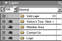
- Turn off the Web layer so that you can see your images better. You
do this by clicking the eye next to the Web Layer in the Layers panel
to toggle it's visibility off.
- If the Frames panel is not visible on your screen go to Window ->Frames.
Expand the Frames panel. You should now be looking at the list of frames.

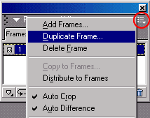
- Duplicate the first frame by clicking on the arrow on the top right
corner of the Frames panel and then selecting "Duplicate Frame".
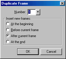
Accept the defaults in the Duplicate Frame dialog box that appears and
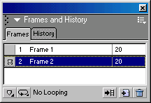
click "OK." You will now have 2 frames.
- Select Frame 2.
- In the document window, select the text, "Contact Us". Use
the Properties panel to change the color of the text. Choose a dark,
reddish brown. (You may have to substitute another type face if Trebuchet
is not on your computer. Be sure to use the same type face for all of
the text in both of the frames.)
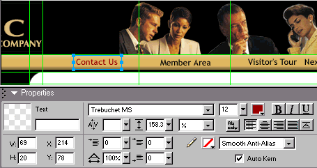
- Repeat step 5 for the text "Member Area" and again for "Visitor's
Tour Next ->".
V. Add the rollover behavior.
Now we have to add the Javascript code that exchanges the rollover images
when the mouse is placed over one of the navigation buttons.
- Turn the Web Layer back on by clicking the empty box next to the Web
Layer to make the eye appear.
- Display the Behaviors panel by clicking on "Window" and
then "Behaviors."
- Using the arrow tool, select the "Contact Us" slice (slice
4).
- Click the "+" button on the Behaviors panel and choose "Simple
Rollover" from the flyout menu. This option creates both the images
and the javascript code that is needed for a rollover. Frame 1 is the
"Off" state and Frame 2 is the "On" state.
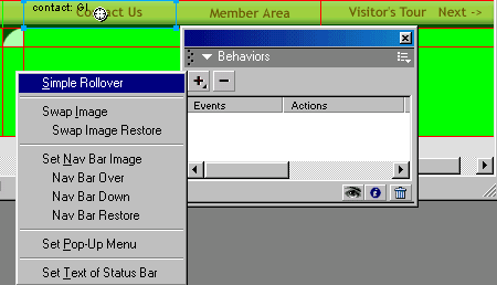
- Repeat step 4 for the "Member Area" button and the "Visitor's
Tour" button.
- You can preview your effect by turning off the Web Layer and clicking
on the Preview tab at the top of your image. Test your rollovers.
VI. Export your files.
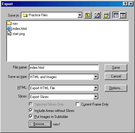
- Choose File -> Export.
- In the Export dialog box,
- Choose the folder that you will use for all of your site files
after "Save in:"
- Next to "File name:" type the name that you would like
to use for this file on your Web site. If this will be your opening
page, type "index.html."
- Next to "Save as type" select "HTML and Images"
so that Fireworks will save both the HTML file and all of the images
that you need to go with it.
- Next to "HTML" select "Export HTML File."
- Next to "Slices" select "Export Slices."
- Put checks in the "Include Areas without Slices" and
"Put Images in Subfolder."
- You can click the "Browse" button to select the subfolder
or to create it if it's not already there.
- After setting all of your options, click "Save."
- Open and test your new Web page in your browser. At this point your
page looks like this. I have shown
2 versions of the resulting table. The 2nd has visible cell borders so
that you can see where the cells begin and end. Note that some of the
cells are entirely empty. Don't worry about that now. We'll be adding
background colors to the cells that need them later.
VII. Use Dreamweaver to adjust your table so that
it fills the width of the browser window.
When I designed my page, I wanted to have a banner that would expand and
contract to fill the entire width of the browser window. Therefore, I will
now use Dreamweaver to tweak the table settings so that they do just what
I want them to do. Here is the finished
product. Here's how to do it:
- Go to Modify -> Page Properties and set all of the margins to zero.
This will eliminate the white space around the banner at the top and
sides of the page.
- Select the table and set the width to 100%. This allows the table
to expand to fill the page. However, there will now be gaps between
my images when the table does expand.
- To eliminate these gaps, add a background image that matches the
gold bar in the cells of the second row. This background image will
fill in the gaps between the images when the table expands.

- Give the cells that are across the top and down the left side a black
background to fill in the gaps between images and provide a black background
for the links on the left.
- Adjust the cell alignments so that the images stay where you want
them to when the table changes sizes. I set the alignment of the cells
that hold the navigation buttons to the right.
- I nested 2 more tables in this main table. The first is a fixed width
table that holds more links. It was placed in the bottom left cell of
the table. The second is an expandable table that holds the content
of the page. It was placed in the bottom right cell. I can change the
content of the page just by changing the content of these two tables.
You might consider making this page a Dreamweaver template with the
last two nested tables set as the editable areas. That's a very efficient
way to reuse your page design on all of the pages in your Web site.
VIII. What did I gain by designing my page as one
large image in Fireworks and then slicing my image up and putting it back
together into a table?
- A page design that contracts to 600 pixels, but also expands to fill
a wider screen.
- A shorter download time because I could save parts of my image as
a .gif, parts as a .jpg and other parts as text areas.
- A quick, easy way to create my rollover images and insert them and
the Javascript code into my page. Note: Fireworks will write the same
Javascript Code that Dreamweaver does, so it's easier to make changes
or add more rollovers later on.
- A way to see how my page elements are going to look together before
I spend a lot of time creating individual small images and laying them
out in a Web page.
-
More time to devote to other things because Fireworks
did a lot of the coding as well as the image creation for me - much
more quickly than I could have done it myself.
Copyright 1999, Judy Fontanella, All Rights Reserved
Judy Fontanella owns her own Web design company called ArtBytes in San
Diego, California. She also teaches both online and face-to-face Web
design classes for Palomar Community College in San Marcos, California.


![]() Using
the Slice Tool, carefully create the 12 slices shown in the diagram below.
It is very important that your slices begin and end exactly on the guides,
or you will end up with a very complex table that will be very hard to
modify later on. If you have turned on "Snap to Guides" under
"View" ->"Guides," it will help you work more accurately.
Watch the origins and sizes of the slices in the Properties panel as you
work. Your slices should have the same dimensions as those in the diagram.
Using
the Slice Tool, carefully create the 12 slices shown in the diagram below.
It is very important that your slices begin and end exactly on the guides,
or you will end up with a very complex table that will be very hard to
modify later on. If you have turned on "Snap to Guides" under
"View" ->"Guides," it will help you work more accurately.
Watch the origins and sizes of the slices in the Properties panel as you
work. Your slices should have the same dimensions as those in the diagram.


![]()
