Logo Primer
by Suz Stephens
I want to explain why a logo should be produced in a vector program
such as Illustrator or Freehand. (Vector art is LINE art -- the digital equivalent
of art done in pen and ink.)
Go back 10+ years -- before we did design work on computers. We dinosaurs
would have designed logos with the entire logo (mark + logotype) drawn precisely
in black ink with Rapidograph pen on white hot press (smooth finish) illustration
board. Or the mark might have been hand drawn and the logotype typeset. The
artwork would have been done oversize -- perhaps 15" wide -- then photographed
on a high contrast black and white graphics copy camera, resulting in a "stat" or "photoprint".
Then the art or stat would have been reshot on the camera, stepping down the
size numerous times until a variety of logo sizes were created. These were
then pasted together on one page, reshot and presented to the client as their
logo.
The reason for shooting the logo in various sizes was to avoid the need to
do photographic enlargements of the logo, which would have degraded the quality.
Illustrator and Freehand vector art solves this problem beautifully since it
can be enlarged without any degradation -- the main reason vector art is preferable
to Photoshop bitmap art for a logo.
Regardless of the fact that we now have quicker, easier ways to produce logos,
the basics of printing technology haven't changed all that much. Artwork still
has to be converted to high contrast black and white negative or positive film,
which is then used to chemically burn printing plates (or screens for screen
printing).
For a logo to work -- to be a true logo -- it must be so simple that
it can be reproduced with an enormous variety of printing or signage production
techniques. In other words, it must be simple line artwork. You can always " dress
up" a logo design, but to be a functional logo, it must at some level be simple
line art.
A logo doesn't necessarily have to be designed in Illustrator. In fact, I
usually start out in Photoshop or QuarkXpress because I can work faster in
either program than in Illustrator. Regardless, I always must keep in mind
how I would reproduce my design in Illustrator. Or I might go back and forth
between Illustrator and Photoshop.
Here's an example of a work in progress, a project that I'm doing for my new
business, CulturedAquaria aquacultured marine corals. Because I'll eventually
need custom printed cardboard cartons, I know that my logo design needs to
be simple line art.
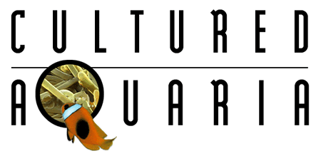
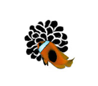
My first idea was to have an anemone and clownfish visible through the Q.
My rough layout worked fairly well in Photoshop, but subsequent efforts to
do a black and white stylized version of the anemone didn't work out to my
satisfaction:
I also became concerned that people might take the logo too literally and
assume that I propagate anemone, a form of coral that's not easily propagated
and is usually collected from the wild instead.
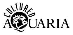
Next, I worked directly in Illustrator, working towards creating a line art
mark with a more generic coral polyp. This is one design that evolved:
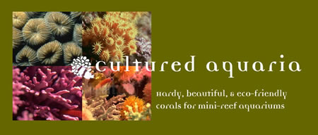
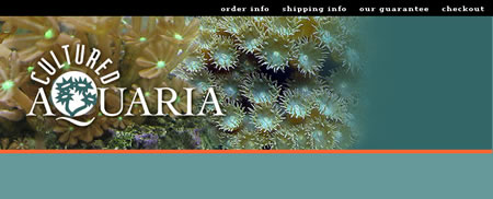
My next step was to start playing around with Web art designs. I liked using
photos of corals as the background art, but found that the little line art
corals in the Q looked too busy and visually redundant when placed over the
photo:
While still in Photoshop, I played around with creating an alternate version
of the logo with a regular open Q. In doing so, I changed typefaces many times
until I found a serif typeface available in both light and medium weights.
I wanted to set the enlarged Q in a lighter weight than the rest of the word
so that it wouldn't appear heavier than the other letters. I liked this approach,
but decided that I would need to reposition it over the background photo so
that several little coral polyp "flowers" would peek through the center of
the Q. (This would eventually require repositioning the background images to
get the logo where I want it.):
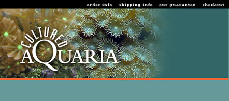
I like the way this looks, so next I would probably go back to Illustrator
and redesign my line art coral flowers so that they more closely resemble those
in the photographic version of the Q. And I might also work on the polyps right
behind the Q in the photo to give them a little more visual emphasis.
So, as you can see, this is a back and forth process during which I always
keep in mind the need for a dead simple line art version of the logo. To be
effective in the long term, any logo design must follow the same principles,
regardless of whether it's drawn by hand or done on computer in Photoshop,
Illustrator or any other program.
If I were doing a Web site for a client who did not already have a logo, I
would make sure that either: 1) they paid extra for a logo design before beginning
the web site design, or 2) they fully understood that they wouldn't be getting
a real logo as part of the Web design.
Suzanne Stephens and her husband Dave have been business partners since meeting on AOL in 1994. Their Lake Oswego, Oregon company Stephens Design specializes in music CD cover design and Web graphics. Suzanne has worked as a print designer and illustrator in advertising agencies, in-house agencies, publishers or design studios, with her focus exclusively on Web design for the last eight years.
Suzanne's rabid insistence that every Web designer must know how to handcode tables was parodied in Dreamweaver email list member Chris Flick's "Wrath of Suz" cartoon. She only wishes her cleavage really looked as Chris imagined it.
[an error occurred while processing this directive]
|